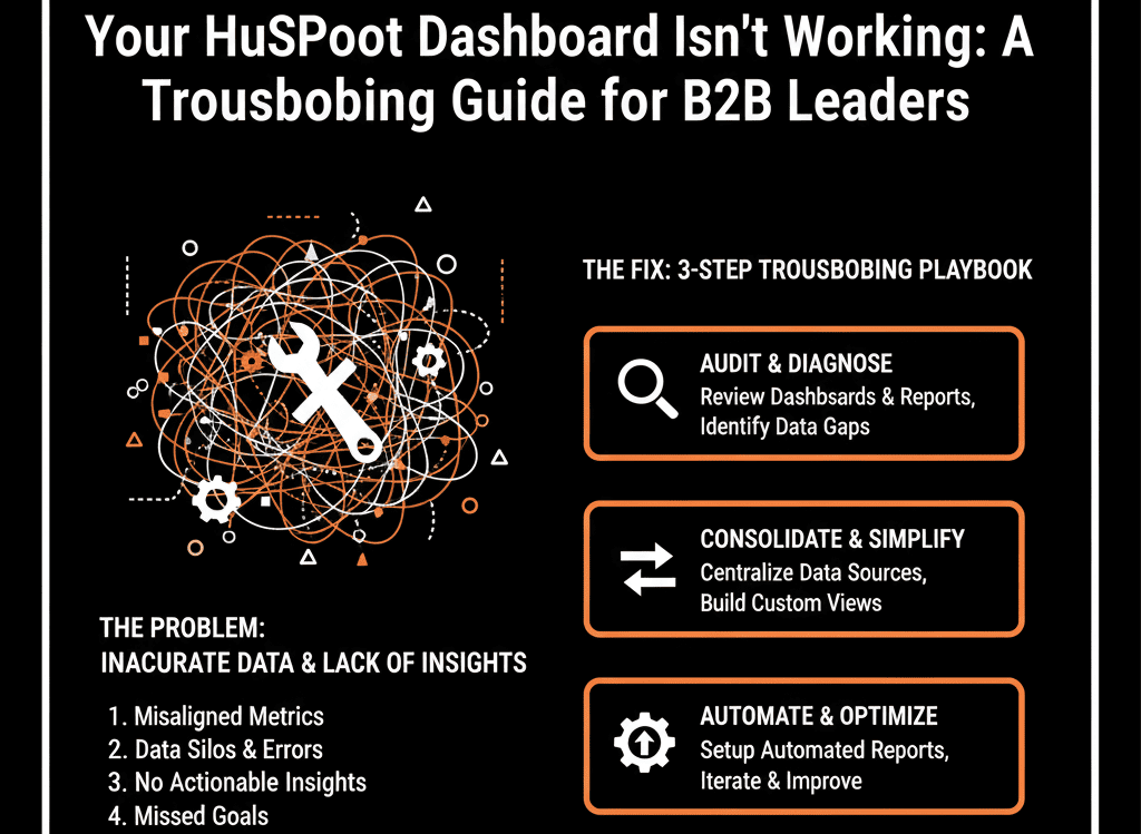
📊 The "Lying" Dashboard: When Your Data Fails You
You're a B2B leader (a VP of Sales, Marketing, or a Founder). You walk into your weekly forecast meeting, and you pull up the "master" HubSpot dashboard you paid a consultant $5,000 to build.
It looks beautiful. But you know it's a lie.
- The "Pipeline Generated" chart shows $4.5M, but your Head of Sales is saying the team is "struggling for new opps."
- The "MQL-to-SQL Conversion Rate" is 25%, but your sales reps are complaining that 90% of leads are "garbage."
- You try to answer a simple question like, "What's our win rate in the Manufacturing vertical?" and you realize the report is blank.
This is the most dangerous situation for a leader. Your "single source of truth" is feeding you inaccurate information, forcing you to make multi-million dollar decisions based on "gut feel" and "shadow" spreadsheets.
Here's the hard truth: Your HubSpot dashboard isn't "broken." Your portal's foundation is.
A dashboard is just a mirror. If your portal is a "messy" junk drawer, your dashboard will show you a high-resolution reflection of that junk. You're trying to fix the mirror when you should be fixing the mess.
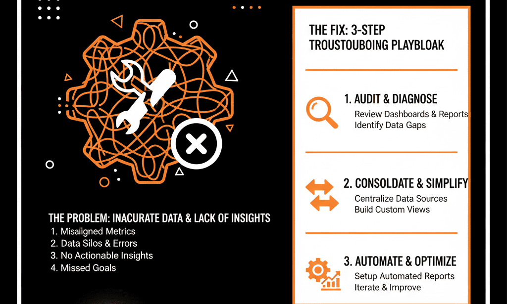
This isn't a "reporting" problem; it's a "systems" problem. Here is the 4-step diagnostic to find the real disease.
🩺 Diagnostic 1: The "Lying" Number
The Symptom: Your reports show numbers that are "directionally correct" but "factually wrong." Your sales reps constantly say, "That number doesn't look right," or "My spreadsheet has the real number."
The Real Disease: A "Property Bloat" & "Data Model" Failure
This is the most common cause. Your dashboard is "broken" because it doesn't know what to measure.
Example: Your dashboard is trying to report on Lead Source, but your portal (as we discussed in our "Property Bloat" guide) has three different versions: Lead_Source, Lead Source - NEW, and Original Source (Import).
The report is only pulling from one of them, missing 70% of the data. The number isn't "wrong"; it's just incomplete, which makes it useless. This is a "Configuration Plan" failure.
The Fix (A "Data Dictionary"): Stop "tweaking the report filter." You must first execute a full property audit. Define your 50 "Golden Properties" (your "Data Dictionary"), merge the duplicates, and update all your assets to pull from that one "Golden" field.
🩺 Diagnostic 2: The "Blank" Report
The Symptom: You (or your RevOps leader) try to build a critical report, but it's impossible. You want to see "Pipeline by ICP Vertical," but the Industry field is "Unknown" on 80% of your deals. The report is blank and worthless.
The Real Disease: A "Sales Adoption" & "Process" Failure
The report isn't broken. Your sales process is.
- This is a "human" problem. Your reps (as we covered in our "Sales Adoption" guide) see the CRM as a "data entry" tool, not a "sales" tool.
- Filling out the Industry field is an "extra click" that doesn't help them close a deal, so they skip it.
- You haven't made that data point mandatory at the correct deal stage. You have no "self-driven" system of enforcement.
The Fix (A "Process-First" System"): You must re-architect your sales pipeline. Make the Industry field (and other "Golden" properties) a required, stage-gated property. A rep cannot move a deal from "Discovery" to "Proposal" until that field is filled. This fixes the "human problem" with a "system solution."
🩺 Diagnostic 3: The "Vanity" Dashboard
The Symptom: Your dashboard is full of data... but it's all "vanity." It tells you what happened, but not why or what's next.
- It shows 1,500 Calls Logged (a Vanity Metric).
- It doesn't show Sales Cycle Velocity by Rep (a Sanity Metric).
- It shows 200 MQLs Created (Vanity).
- It doesn't show MQL-to-SQL Conversion Rate by Campaign (Sanity).
The Real Disease: A "Strategic" Failure — dashboard measures activity, not velocity or outcomes.
Your dashboard isn't "broken"; it's just "dumb." It was built to measure activity, not outcomes and velocity. This is a "rookie" mistake that "how-to" consultants make. It's a dashboard for "inspecting" your team, not "coaching" them.
The Fix (A "RevOps" Dashboard): Scrap it. A B2B leader's dashboard must answer "Sanity" questions.
- "How fast are we winning?" (Report on Deal Velocity)
- "Where are we winning?" (Report on Win Rate by ICP Vertical)
- "Where are we leaking?" (Report on Conversion Rate by Deal Stage)
- "Are our MQLs valuable?" (Report on MQL-to-Closed Won % by Source) If your dashboard doesn't answer these 4 questions, it's not a "Revenue" dashboard.
🩺 Diagnostic 4: The "Contradictory" Report
The Symptom: This is the ultimate "trust-killer." Your "Marketing Dashboard" shows 250 MQLs. Your "Sales Dashboard" shows 180 MQLs. Both are pulling from HubSpot. Your VPs are now in a full-blown argument in the forecast meeting.
The Real Disease: "Attribution" & "Definition" Failure
Your VPs are arguing because they haven't agreed on the definition of an "MQL."
- Marketing's Report: "Show me all contacts whose Lifecycle Stage ever became 'MQL' this month." (This is an activity report).
- Sales' Report: "Show me all contacts currently in the 'MQL' stage who were created this month." (This is a snapshot report).
- Both reports are "correct," but they are measuring two different things. This is a "Configuration Plan" failure. You haven't defined your "self-driven" handoff logic.
The Fix (A "Single, Shared" Dashboard): You must build one dashboard that both VPs use. It must be built on a "Golden" property that you all agree on (e.g., MQL Date). The report should be "Show me a count of all contacts where MQL Date is this month." This is an objective, "self-driven" number that ends the argument.