

📋 The "Boring Form" Problem
You spend $10,000 driving traffic to your landing page.
The prospect arrives. They see a wall of 10 gray input fields asking for "First Name," "Last Name," "Company Size," and "Budget."
They sigh. They bounce.
This is the "Friction Tax."
In 2026, B2B buyers expect a "consumer-grade" experience. They don't want to fill out a tax return; they want to have a conversation.
This is why tools like Typeform (Conversational Forms) have exploded. They promise higher conversion rates by asking one question at a time.
But HubSpot Forms are native, fast, and free.
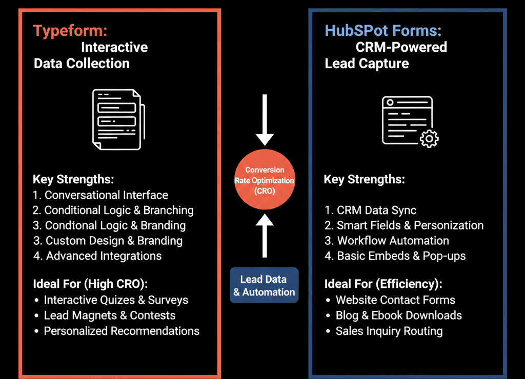
Which one should you use? The answer isn't "always Typeform." It depends on your Context.
Here is the CRO guide to choosing the right tool for the job.
🥊 The Contender: HubSpot Forms (The "Workhorse")
HubSpot Forms are the backbone of inbound marketing.
- Pros:
- Zero Latency: The data hits the CRM instantly. No API lag.
- Progressive Profiling: If a lead returns, HubSpot remembers them. It hides the "Email" field and asks a new question (e.g., "What is your biggest challenge?"). This builds data over time.
- Pop-Up Forms: Native slide-in and pop-up forms are incredibly easy to deploy.
- Cons:
- The "Tax Return" Look: Standard embedded forms can look boring and intimidating if they are long.
- Limited Logic: While you can do dependent fields, you can't build complex "quiz" logic easily.
Best Use Case: Bottom-of-Funnel (BOFU).
- "Contact Us."
- "Request a Demo."
When a prospect is ready to buy, they don't want a "chat." They want to type their info and hit submit. Speed is key.
🥊 The Champion: Typeform (The "Conversationalist")
- Pros:
- Completion Rate: By showing one question at a time, users are less overwhelmed. Completion rates can be 20-50% higher for long surveys.
- Logic Jumps: "If they answer 'Agency,' jump to Question 5. If 'SaaS,' jump to Question 10." This allows for powerful segmentation.
- Visuals: You can use images and videos as answer choices.
- Cons:
- The "Integration" Layer: It requires a connector. Sometimes data syncs fail.
- Cost: It is a separate subscription.
Best Use Case: Top-of-Funnel (TOFU) & Nurture.
- "Get Your Marketing Score (Quiz)."
- "Onboarding Intake Form."
- "NPS / Feedback Survey."
When you need a lot of data but don't want to scare the user, Typeform wins.
⚔️ The Head-to-Head: Feature Breakdown
| Feature | HubSpot Forms | Typeform |
|---|---|---|
| UX Design | Standard / Functional | Conversational / Beautiful |
| Completion Rate | Good (Short Forms) | Excellent (Long Forms) |
| Progressive Profiling | Yes (Native) | No (Complex) |
| Logic Branching | Basic | Advanced |
| CRM Speed | Instant | Near-Instant |
| Cost | Free | Paid |
The "Hybrid" Strategy
- Smart RevOps teams don't choose one. They use both.
- Use Typeform for "Engagement":
- Put a "Calculators" or "Quiz" on your blog. Use Typeform to capture the lead in a fun way.
- Use the integration to sync the answers to HubSpot Custom Properties.
- Use HubSpot for "Conversion":
- On your "Pricing" page, use a standard, short HubSpot form. Don't make them click through 10 screens just to talk to sales.
Don't Let the Form Kill the Lead.
If your "Request a Demo" form has 12 fields visible at once, you are losing money.
If your "Quiz" looks like a government document, you are losing engagement.
Design matters.
Not sure if your forms are converting?
Optimize Your Conversion
This is part of our Free HubSpot Health Check. We will audit your "Conversion Paths." We'll look at your form analytics, your drop-off rates, and your friction points. We’ll tell you where to swap in Typeform and where to stick with HubSpot.
Optimize Your Conversion. Get Free Hubspot Audit.