

Why Most CEOs Hate Logging into HubSpot
When we speak with CEOs, they usually fall into two camps:
- “I don’t log into HubSpot. I just ask for screenshots.”
- “When I do log in, I see 20 dashboards and still don’t know what’s going on.”
That’s not a CEO problem. That’s an architecture and reporting problem.
A CEO doesn’t need to see every operational detail.
They need a small, sharp view that answers:
- Are we creating enough pipeline?
- Is that pipeline converting?
- Is it aligned to our ICP and strategy?
- Where are we leaking revenue?
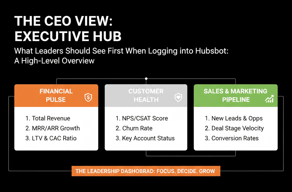
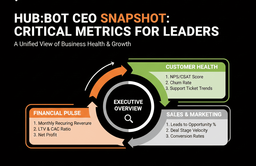
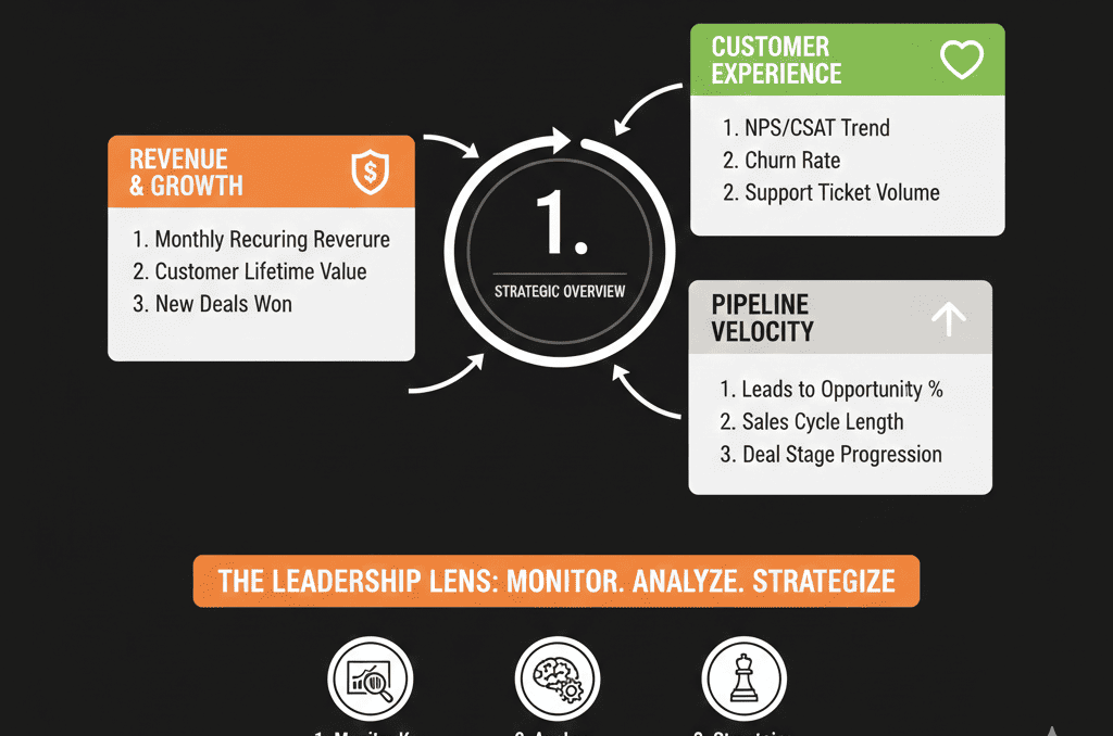
This article explains what we design as the “CEO View” in HubSpot—the dashboard leaders should see first when they log in.
Principle 1 – One Dashboard, Not Ten Tabs
The CEO view should live in one primary dashboard, not spread across multiple places.
We structure it into 4–5 sections:
- Pipeline & forecast
- New pipeline creation
- Funnel and conversion
- Source and segment mix
- Risk and data sanity
Everything else can live in Ops or team dashboards.
Section 1 – Pipeline & Forecast (Top-Right of the Dashboard)
This is the first thing a CEO should see:
1. Current open pipeline vs target
Core report ideas:
- Open deal amount by stage (this quarter and next).
- Pipeline coverage (pipeline amount / target) for the current period.
Why it matters:
- Shows whether there is enough pipeline in each stage to hit revenue goals.
- Helps quickly spot over-reliance on late-stage deals or one or two big opportunities.
2. Forecast vs target
If you use HubSpot’s forecasting:
- Forecast amount vs target by month/quarter.
- Breakdown by team or region (if relevant).
If not using the forecast tool, build a simple model:
- Weighted pipeline (e.g., amount × stage probability) vs revenue target.
This helps answer: Are we on track? Is the team optimistic, realistic, or behind?
HubSpot’s forecast tool (Sales Hub Professional/Enterprise) is designed to track progress toward forecastable revenue goals and lets you configure forecast amounts, forecast categories, and forecast columns—so “forecast vs target” can live as an always-available CEO widget, not a spreadsheet exercise.
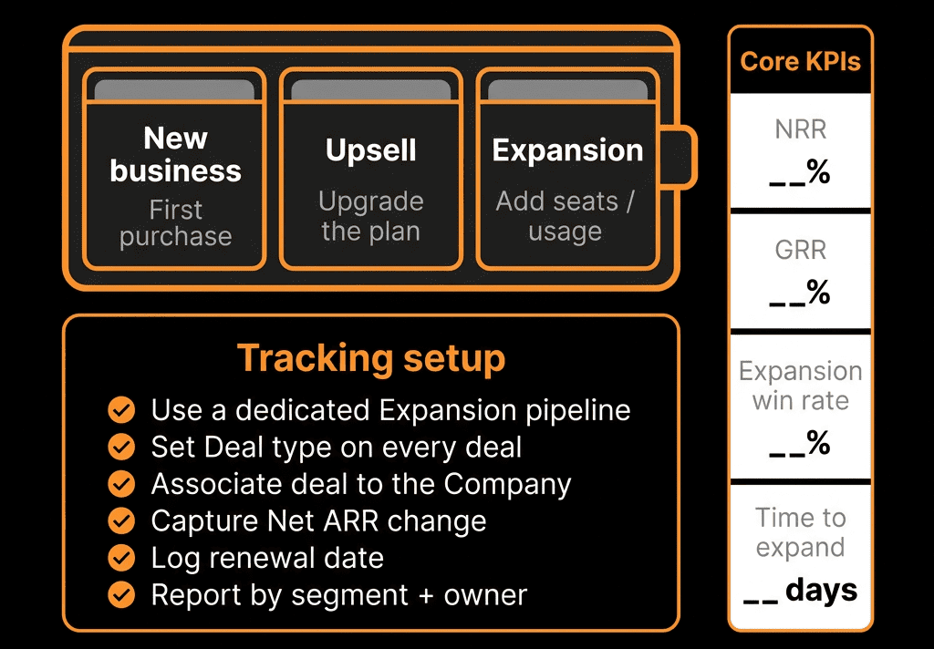
Section 2 – New Pipeline Creation (Health of the Front Door)
Revenue later depends on pipeline created now.
3. New deals created by week/month
Show:
- Count and total amount of new deals created per week or month.
- Compare to the same period last year or to a target trend line.
Why it matters:
- If new deal creation slows, future revenue will follow.
- CEOs can see if top-of-funnel and mid-funnel motions are working.
4. New opportunities by segment/ICP
Break down new deals by:
- Segment (SMB/mid-market/enterprise).
- ICP fit (A/B/C tiers if you use them).
- Region or product line.
This quickly answers: Are we building pipeline where we actually want growth? Are we drifting into non-core segments just to keep numbers up?
Section 3 – Funnel and Conversion (Leakage View)
A CEO doesn’t need every micro-metric, but they do need to know where the funnel is leaking.
5. Lifecycle funnel conversion
Standard funnel view:
- Lead → MQL → SQL → Opportunity → Customer.
- Conversion rates and absolute numbers over a chosen period.
This answers: Are we generating enough Leads/MQLs at the top? Are SQL and Opportunity rates healthy? Are there clear drop-off points?
If you don’t trust lifecycle data today, that becomes a clear HubSpot Health Check action item.
6. Opportunity stage conversion and velocity
Key reports:
- Stage-to-stage conversion: % of deals moving from one stage to the next.
- Average days in stage for each core stage.
This helps a CEO see where deals routinely get stuck and whether the team is moving deals fast enough, not just creating them.
HubSpot’s Sales Analytics suite includes a “Time spent in deal stage” report that shows average time deals spend in a stage (and can be grouped by rep/team), which is a clean way to add “velocity” to the CEO view without building a complex BI model.
Section 4 – Source and Segment Mix (Strategy Alignment)
The CEO view should connect where growth is coming from to your strategy.
7. Revenue and pipeline by source
Using a normalized Lead source field:
- Show pipeline and closed-won revenue by source (Paid Search, Organic, Partner, Outbound, Event, etc.).
- 3–6 month trend if possible.
Why it matters:
- Are we dependent on one channel?
- Are the expensive channels actually driving revenue?
8. Revenue and pipeline by ICP segment
If you’ve defined ICP tiers or segments:
- Show pipeline and revenue by segment (e.g., ICP A/B/C, industries, company size bands).
This helps answer: Are we winning in our ideal customer profile, or drifting into low-fit accounts just to hit numbers? Are our strategic bets paying off?
Section 5 – Risk and Data Sanity (Trust in the System)
Finally, a CEO needs to know: Can I trust what I’m looking at?
9. Basic data hygiene indicators
Short, sharp widgets:
- % of deals with no amount or no close date.
- % of deals with no associated company.
- % of contacts missing critical fields (e.g., lifecycle, lead source, country).
If these are high, the dashboard should almost scream: “We have a data problem to fix before we scale further.”
10. SLA and speed-to-lead summary
For inbound, high-intent leads:
- Average time to first touch.
- % of demo/contact sales leads touched within SLA (e.g., first 2 hours or first day).
This shows whether you’re wasting the demand you already have and whether the lead-handling process can keep up with increased spend.
HubSpot includes default lead properties such as Time to First Touch (time between lead creation and first outreach activity), which can be used for SLA and speed-to-lead reporting without custom calculations.
How to Build a CEO Dashboard in HubSpot Without Overcomplicating It
You don’t need a perfectly clean system to start. You need a clear intent and a willingness to iterate.
Practical steps:
- Identify 5–7 must-have questions your CEO wants HubSpot to answer.
- Build one dashboard called: “CEO View – Revenue & Pipeline”.
- Add the reports outlined above, using whatever clean data you currently have.
- Label the dashboard clearly as: “Source of Truth: Revenue View”.
- Review it monthly with leadership: what’s useful, what’s confusing, and what needs better data behind it.
- Then, use the gaps as input into your HubSpot improvement roadmap.
Common Objections We Hear from CEOs (And How We Address Them)
“Our data isn’t perfect, so I don’t trust any dashboard.”
We agree you shouldn’t pretend it’s perfect. But you can start with pipeline totals, basic funnel movement, and rough source/segment breakdown.
Every inconsistency you see is a signal for what to fix next.
“I don’t have time to learn HubSpot.”
You shouldn’t have to. You should have one bookmarked CEO dashboard, a short monthly review with RevOps or your HubSpot partner, and clear owner(s) who can answer, “Why does this number look like this?”
“We already do reporting in spreadsheets / BI.”
That’s fine. But if HubSpot is your operational system, it should reflect reality, agree with your other tools on core revenue and pipeline numbers, and be accessible without waiting days for a manual report.
Want a CEO-Ready HubSpot View Designed for Your Business?
If your leadership team doesn’t log into HubSpot—or logs in and leaves more confused than before—the issue is not them. It’s the way the portal and reports were designed.
Our HubSpot Portal Health Check / HubSpot Audit is built to fix this for scaling B2B teams:
- We assess your current architecture, data quality, and reporting.
- We design a CEO-ready dashboard tailored to your revenue model and goals.
- We provide a clear roadmap for cleaning up the underlying data and processes so that dashboard can become your operational truth.